Frankie& Paws
A founder-led dog wellness brand needed an online home that reflected the care behind its products. We translated the founders’ identity and story into a calm, editorial shop, built the ordering and dispatch tools to run it, and have kept improving it since.
- Client
- Frankie & Paws
- Sector
- Founder-led British dog supplement brand
- Range
- True Calm, Biome Balance, Collagen, plus collections
- Services
- Web design, digital brand implementation, tone of voice, ecommerce build, operational tools, technical SEO, content, ongoing development
- Period
- February 2026 to date, ongoing
- Live site
- frankieandpaws.com

Premium,
without the noise.
Frankie & Paws makes daily supplements for dogs: True Calm, Biome Balance and Collagen, formulated in Britain and sold direct to UK dog owners. The founders had a brand book, a website guide, a story worth telling and a dog called Frankie. What they needed was a shop that felt as considered as the products.
The brief had real tension in it. Carry a restrained identity through an entire shopping journey, including forms, basket, emails and account pages. Give the founder story room without getting in the way of buying. Explain ingredients, benefits and dosage for a fairly technical range without turning the buy box into an essay. Build search visibility around the category and its ingredients while keeping the tone quiet. And give two founders practical tools to run orders, dispatch, customers, promotions and referrals themselves.
An identity,
made to work.
The identity was the founders’ own. Our job was digital art direction: reconciling the brand book and website guide, writing down the rules, and turning them into a design system that holds across every template. Forest green, warm cream and quiet neutrals, expressed as CSS variables. Astralaga for display, self-hosted, paired with Poppins for reading. Spacious layouts and large photographic areas.
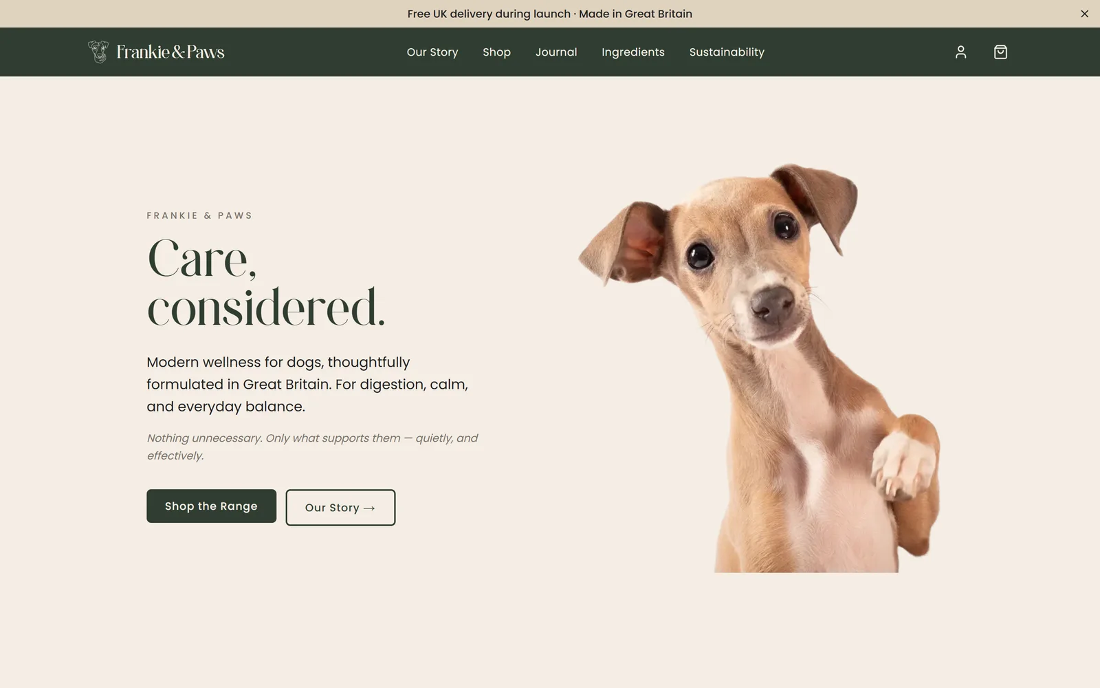
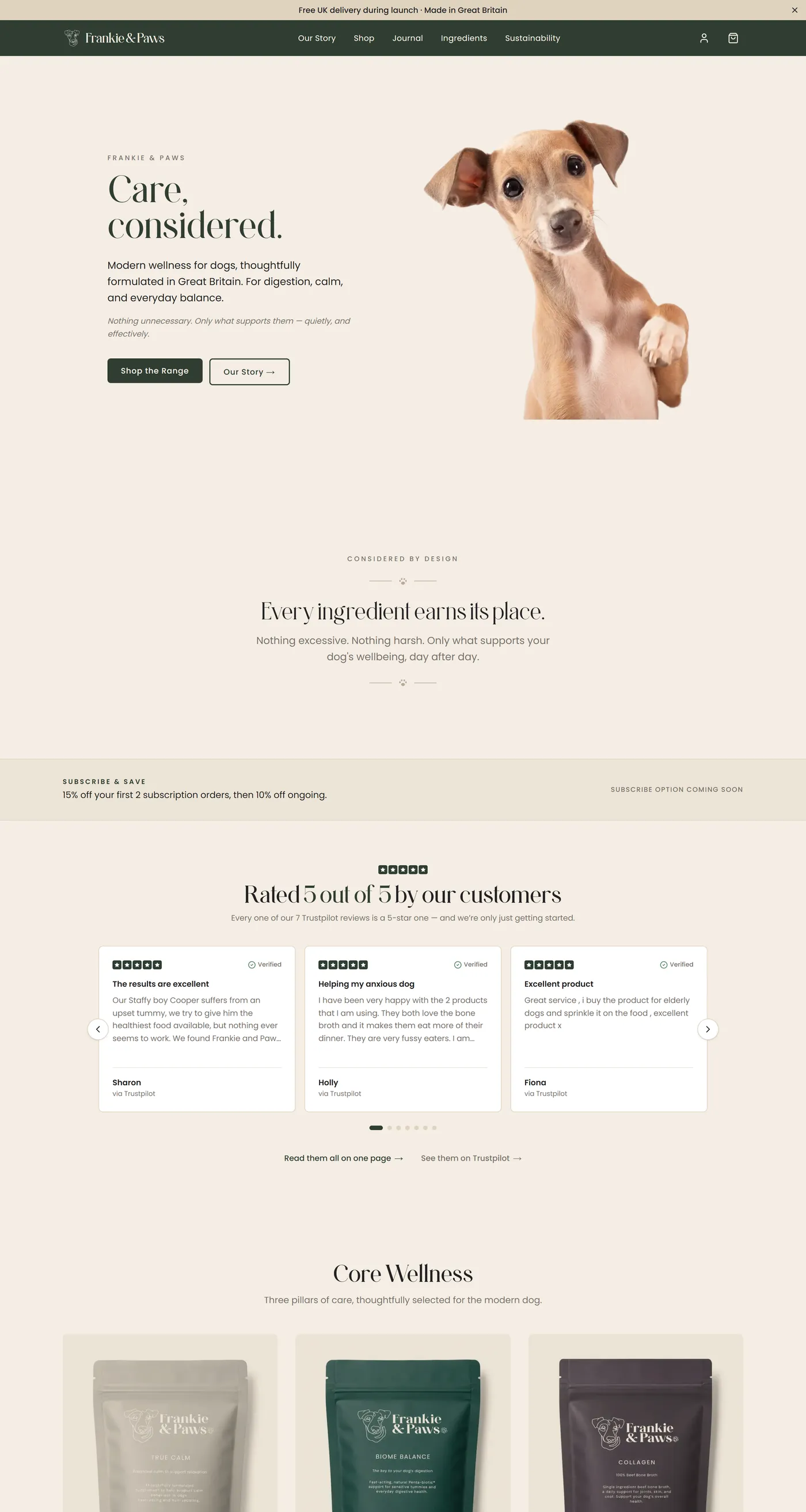
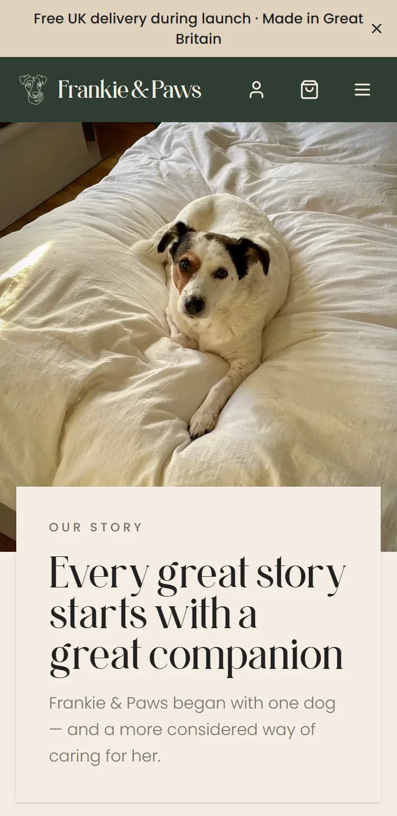
The homepage went through several passes as real assets arrived. It settled on a cut-out puppy sitting directly on the cream, beside “Care, considered.” and a short description of the range. The descriptive line carries the H1 for search; the two words carry the brand. Below it: products, the founders’ story, ingredients, reviews, the journal, social imagery and email capture, with the rhythm and crops refined against founder feedback.
A photography brief translated the site’s needs into a shot list, crops and delivery specs. We prepared the transparent cut-outs and integrated founder portraits, Frankie, packshots and lifestyle imagery across desktop and mobile. The voice was documented too: understated, intelligent, calm, assured. Short sentences, specific information, no superlatives, no cute pet talk.

Clarity first,
depth underneath.
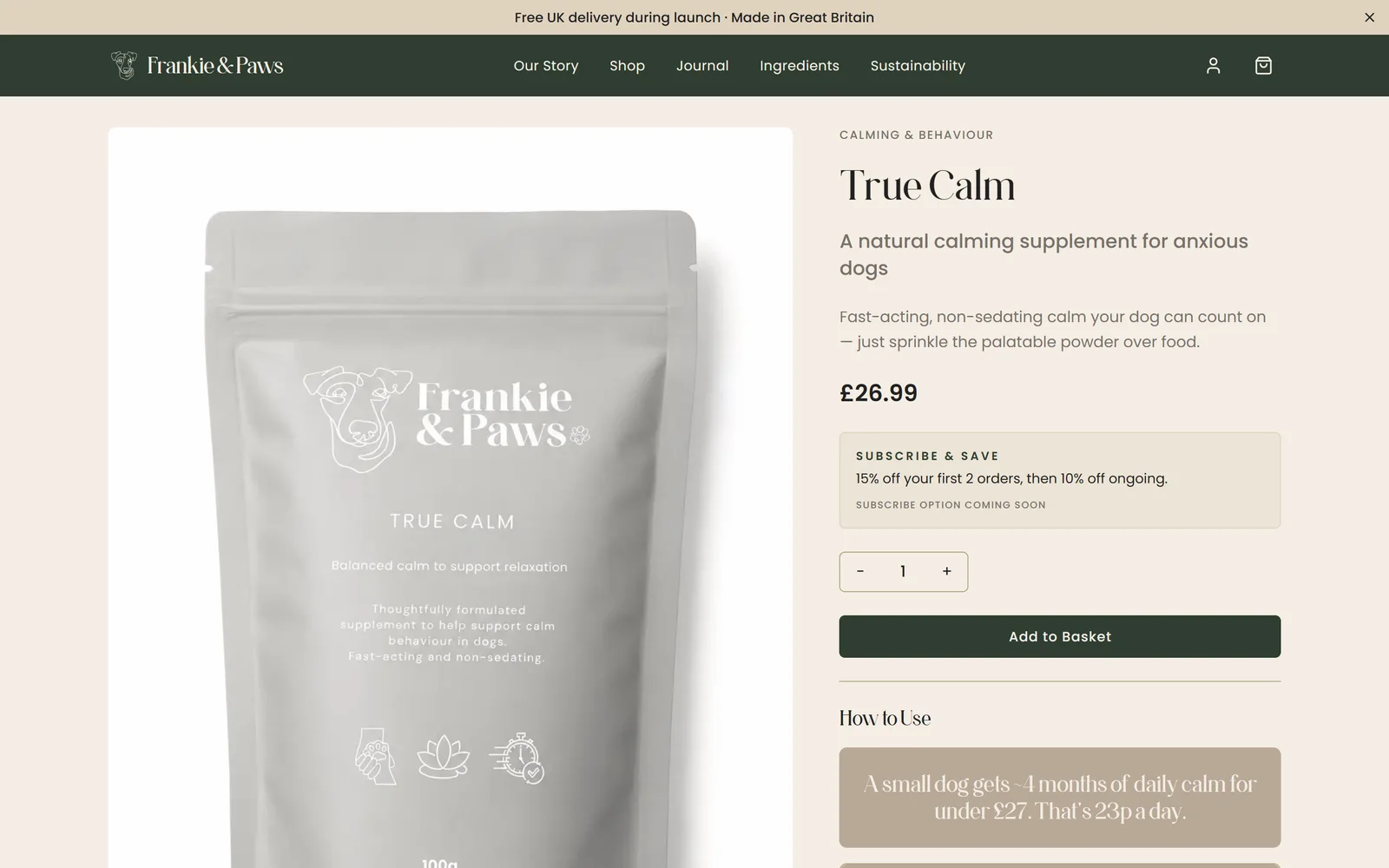
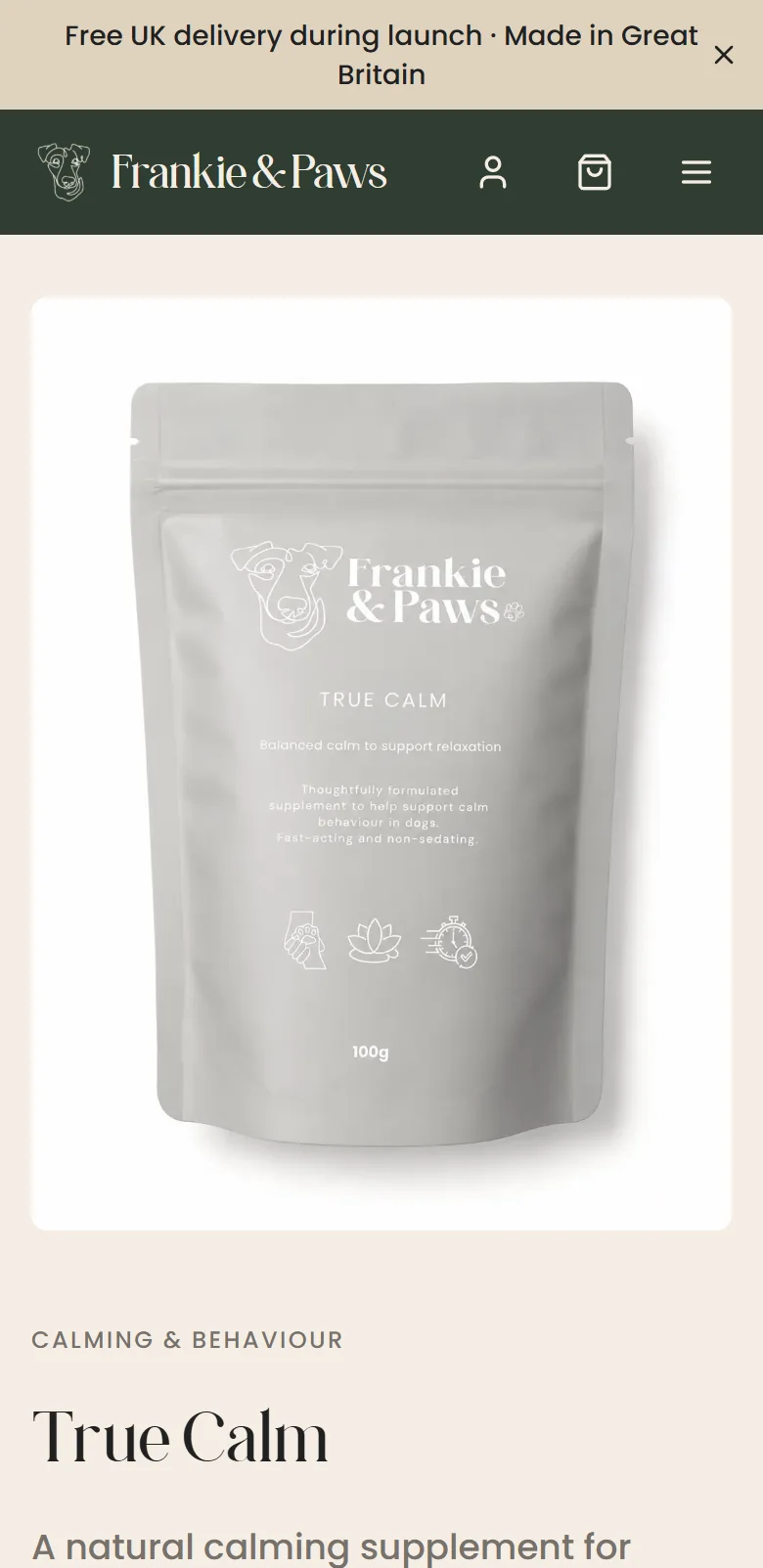
The product page is the clearest example of design and search being decided together. An early version placed a 250-word introduction, written for search, between the product name and the purchase controls. It pushed the price and Add to Basket too far down the page. In July we rebalanced it: a short, benefit-led pitch beside the name, then price, quantity and purchase controls, with the full explanation kept in an About section further down alongside ingredients, benefits, usage and FAQs. The crawlable content stayed. The buying hierarchy came back.
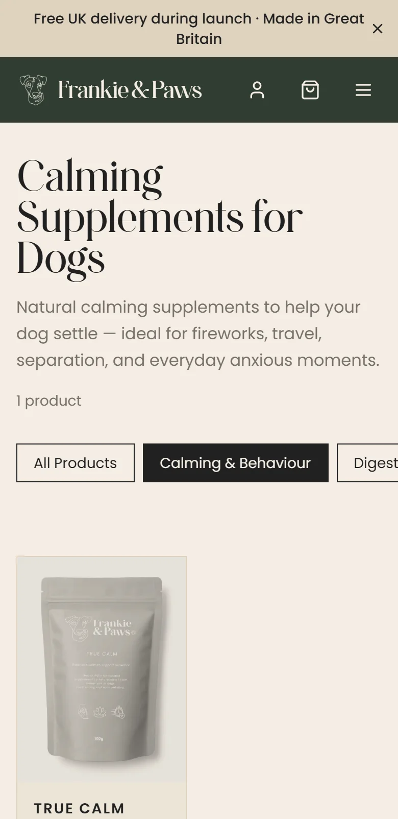
The storefront itself is custom: product listings and categories, galleries, collections and bundles, and a persistent basket. Checkout hands off to Stripe, configured for GBP and UK addresses. Later hardening moved product identity, pricing, stock checks and variant validation to the server, so the browser only submits identifiers and quantities. Payment webhooks map paid lines back to products and persist orders with a financial snapshot; anything unrecognised is rejected rather than silently producing a partial order.
Customers can register, sign in, see their orders and receive confirmation and dispatch emails that look like the rest of the brand. Subscribe & Save is a coming-soon surface; recurring billing is part of the next phase, not a delivered feature.
Tools to
run the business.
An access-controlled administration area built around how the founders actually work, from a payment landing to the parcel leaving. Finance views are operational payment data, not a substitute for accounts.
- Dashboard
- Order activity, gross collected, pending dispatch and subscriber overview
- Orders
- Status filtering, order detail, dispatch action and tracking email
- Customers
- Purchase history, order counts and lifetime value, including guest customers
- Promotions
- Signup records, database-managed codes and newsletter offer copy
- Referrals
- Referral links, promo attribution and commission records
- Stripe finance
- Read-only balances, payments, fees, refunds, disputes, payouts and reconciliation
One question,
one page.
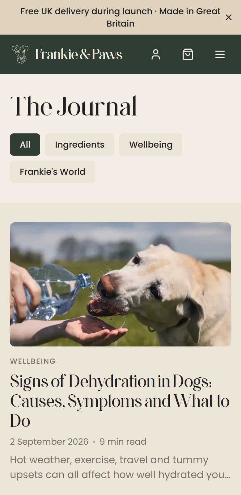
The site’s search architecture divides intent deliberately. Category pages answer generic commercial searches. Product pages answer the named products and the buying decision. A ten-ingredient reference hub explains each ingredient and its role in the range. Journal articles answer the broader questions owners actually ask, from dehydration to hot-weather digestion. Titles were later tightened to stop these pages competing with each other, and internal links were reworked so older articles have routes into them.
Technical foundations underneath: canonical URLs, page-specific metadata and Open Graph, sitemap coverage, redirects, genuine 404s and crawl directives. Structured data covers the online store, products and offers, shipping and returns, breadcrumbs, articles and FAQs where the visible content supports them. Store-level Trustpilot ratings were removed from product schema rather than presented as product reviews. A Google Merchant Center feed is generated from the same database prices the checkout uses.
Content work ran through the whole site: homepage messaging, the founders’ story, product and dosage information, transactional emails, buying guides and policy pages. Endorsement wording was tightened and misleading trust signals removed. Health-sensitive copy stays subject to founder and manufacturer fact review; we describe the editorial process, not the efficacy of the supplements.
86%
Less image weight on the homepage
Mobile image payload, recorded production-build comparison, 30 August 2026. In-page images only, not total page weight or field Core Web Vitals.
An August audit found the homepage hero and section wrappers were served hidden, waiting for JavaScript and an entrance animation before anything important appeared. The hero became a server component with its image prioritised, and section motion now starts from visible output and only animates below the fold. Hidden elements in the served HTML went from eleven to zero.
Images moved to a build-time pipeline: Sharp generates responsive WebP variants during the build, so nothing is processed at request time and the earlier memory pressure on the old host went away.
Image payload per page, KB. Source: project audit of 30 August 2026.
Built to
keep going.
In September the application moved from Render to Vercel and the database to Supabase, both in London. The transfer was rehearsed, row counts verified, the domain cut over and the live Stripe webhook confirmed against the canonical endpoint.
- Application
- Next.js App Router, React, TypeScript
- Data
- Prisma with PostgreSQL: products, orders, customers, editorial and marketing
- Payments
- Stripe Checkout with server-side pricing, stock and variant validation; webhooks persist orders
- Resend and React Email: welcome, order confirmation, dispatch and founder notifications
- Accounts
- Auth.js with customer accounts and admin access controls
- Images
- Sharp at build time, responsive WebP variants, custom image loader
- Measurement
- Plausible with product view, add-to-basket, begin-checkout and purchase events
- Hosting
- Vercel (London functions) and Supabase PostgreSQL (London), deployed from GitHub
Delivered.
Still going.
What is evidenced: a bespoke, branded ecommerce site refined through months of founder feedback; an engagement that covered voice, content, search and business operations; a product page rebalanced towards buying; a large, recorded reduction in image weight; and an infrastructure migration completed with data verification.
What we do not claim: revenue growth, conversion uplift or ranking gains. The site is young and the search data is an early baseline. The next phase is documented: UK authority building, further search-led editorial, product-specific review collection, subscriptions and steady maintenance. When comparable periods of relevant search and funnel data exist, this page will be updated with them.
Quiet brand.
Serious engineering.
A calm shop on the surface, and a full set of payment, dispatch, customer and finance tooling underneath. That is what a small brand needs to run itself.
Selling online
without the template?
Or just email
hello@stourbridgewebstudio.co.uk